Journal 5

Uber has a very interactive website that uses different functionalities to keep users engaged. Users can either scroll down the home page to find the content they desire or click on the menu tab on the right-hand side of the screen. A usability study was created to find out how long it takes users to navigate through the Uber website. Untitled-3 
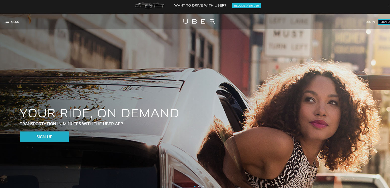
Usability Questions: The following questions are based off of the Uber website which is located : https://www.uber.com/

  1. Find on the website where the Career page is. How long did it take for you to find it?
  2. From the Uber website, locate where to redirect yourself to the company’s Facebook page. How long did you take to find it?
  3. Find the nearest city that Uber operates in relation to your current geographic location. How long did you take to find it?
  4. Locate the company’s blog site. How long did that take you?
  5. Find Uber’s Privacy Policy. How long did that take you?

Results: 4 users took the usability test and below are the results for the corresponding questions-

  1. 2.75 Seconds
  2. 3.25 Seconds
  3. 37.25 Seconds
  4. 4.50 seconds
  5. 22.75 seconds

Strengths and Weaknesses:

The strengths of the Uber website is that it is a lot more visually appealing compared to its competitors’ sites. The weakness of the website though is that it is hard to maneuver your way through it. On average it took 37.25 seconds to find the nearest city to them that operates Uber. This is something that takes too long to uncover and it also could leave users frustrated with the overall website.

Recommended Improvements:

An improvement to the website that Uber might want to take into consideration is to simplify their website. They should get rid of the scrolling feature on the homepage and stick with the website being easy to navigate through. They could make the menu options bigger and could make the categories a little more diverse so users can find exactly what they are looking for with ease.

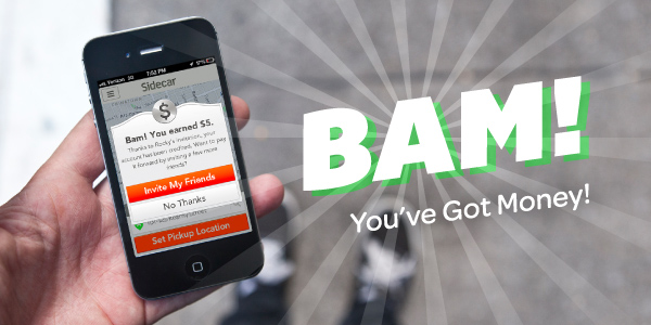
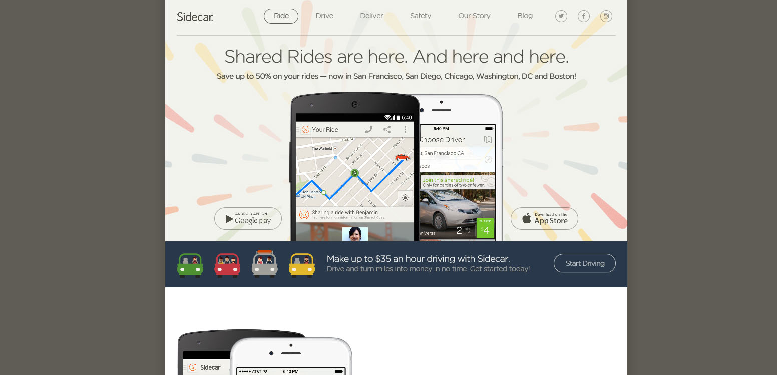
Competitor Websites:
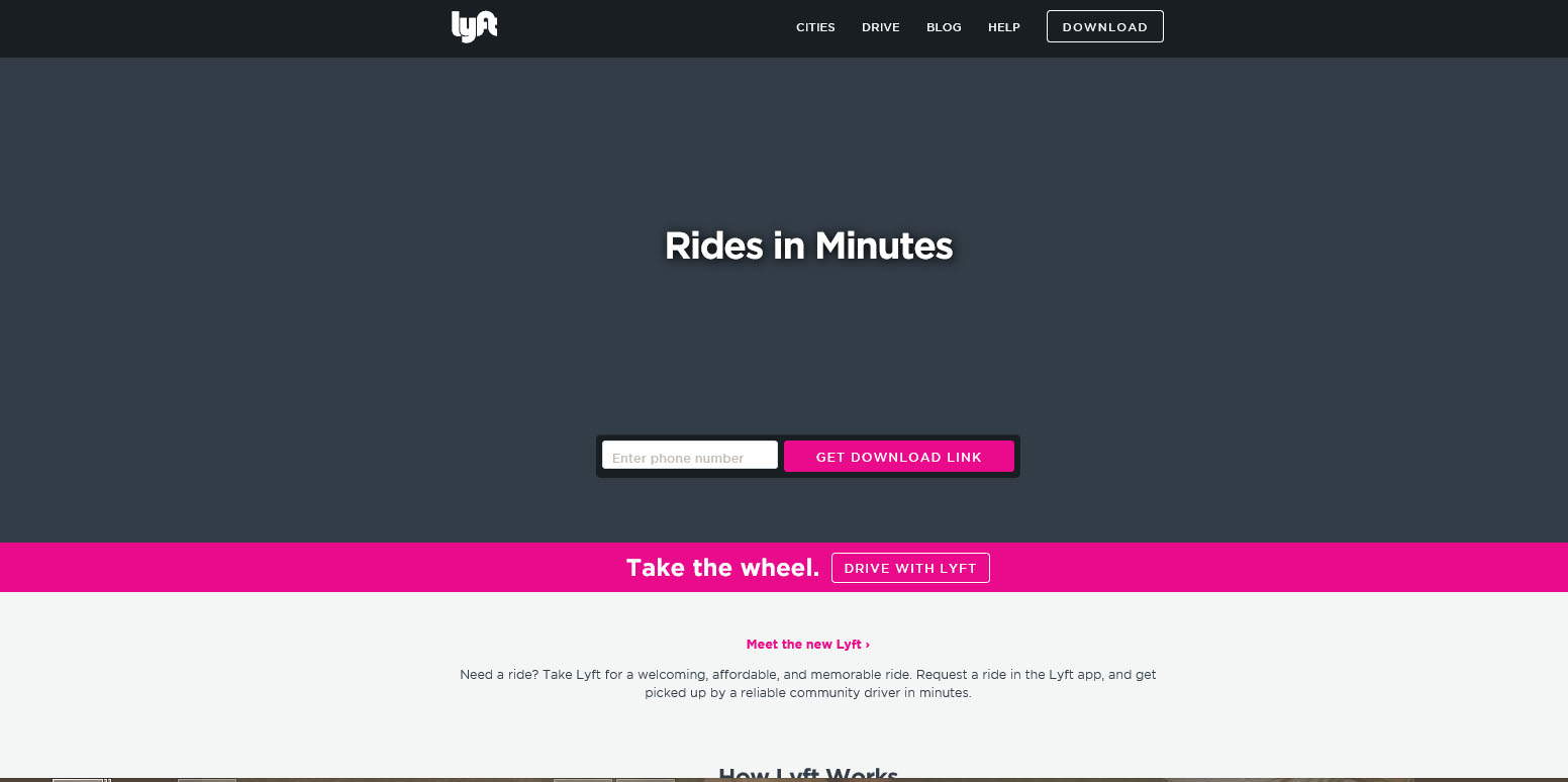
 Untitled-1 Untitled-2 References:

Lyft. (n.d.). Retrieved April 29, 2015, from https://www.lyft.com/

Sidecar. (n.d.). Retrieved April 29, 2015, from https://www.side.cr/

Uber. (n.d.). Retrieved April 29, 2015, from https://www.uber.com/

Journal 4

Synergy-based advertisements are very important in an organization’s marketing efforts. Effectively using typography and visually appealing content is essential in creating a successful advertisement. The following 5 advertisements all effectively display synergy:amtrakadvertisementAmtrakCoastalAd Amtrak does a very good job of not only using visually appealing graphics in their advertisements, but also using useful content as well. Giving ad viewers a feeling of being outside, and inside of a train is a great marketing tactic. The ads appeal to a very large target audience which makes it relatable to all. They have successfully used the right amount of words with the right amount of visual graphics which leads to a successful ads. CNSPhoto-RYNOR-GREYHOUND Although the overall ad is very simple, Greyhound does a great job of portraying their overall message. The advertisement is visually appealing, and it also uses typography concepts to make its wordings pop out. Viewers immediately get a sense of what Greyhound is, what the company does, and the message it’s trying to portray which overall makes it a great ad. Uberad.png I thought that this advertisement should be included in this week’s blog post because Uber does a great job of delivering a synergy-based ad. Uber attacks its competition, Lyft by shaving off the company’s logo and giving viewers a strong message. The ad does a great job of using pictures and typography to deliever a powerful advertisement. Although this isn’t a competition’s advertisement, I feel that for this week’s journal post it shouldn’t be looked over. preview.Megabus_SunSet_FINAL In this advertisement by Megabus, they use typography and visual graphics very well. The pictures used are very different from normal ads which makes it stand out from the start. The strong wording used also draws attention and gives the viewer a realization about the offerings Megabus has.

References:

Amtrak “My Black Journey” Advertisement. (2012, April 24). Retrieved April 22, 2015, from https://naturalhairinthemedia.wordpress.com/2012/04/24/amtrak-my-black-journey-advertisement/

Amtrak Pacific Surfliner to San Luis Obispo, Solvang, Santa Barbara, and Ventura, California. (n.d.). Retrieved April 22, 2015, from http://trainweb.org/carl/CarFreeCentralCoast/

Greyhound Traveler Turns Wendigo. (2008, October 19). Retrieved April 22, 2015, from https://weeklyrot.wordpress.com/2008/10/19/greyhound-traveler-turns-wendigo/ Marx, T. (n.d.).

CMYK Magazine // Tori Marx / Portfolio // Showcasing Artist Talent Competitions in Graphic Design, Illustration, Photography and Art Direction. Retrieved April 22, 2015, from http://www.cmykmag.com/portfolios/tori.marx.html#2

Swan, R. (2014, May 30). Uber and Lyft Cannibalizing Each Other in New Ad Campaigns. Retrieved April 22, 2015, from http://www.sfweekly.com/thesnitch/2014/05/30/uber-and-lyft-cannibalizing-each-other-in-new-ad-campaigns  

Inspiration Journal 3

The visual aspects of advertisements is very important when trying to create a successful marketing and advertising campaign. The follow advertisements by 3 different competitors of Uber showcase different ways of effectively promoting their organization with images and typography.

more-than-a-ride-02-2014

Lyft has created multiple advertisements based on different target segments. These ads are based around people from different backgrounds who all share the common interest of driving Lyft. All 3 advertisements not only use physical pictures, but use typography as well to make the advertisement visually appealing. Creating different, but similar advertisements is a smart marketing strategy because it allows the ads to focus on a larger target audience.

tucker

Amtrak created a successful advertisement based around a user’s experience with the transportation service. The ad is visually appealing due to the colors used and the realistic look of the overall advertisement. The viewer immediately feels a sense of familiarity when they look at the ad because the woman featured can be related to multiple target audiences. The road map that goes through the ad also forces the viewer to read the wording which is an important part of the ad itself.

sidecar-referral-code

Sidecar uses a combination of visual and design concepts to create an effective advertisement. The ad showcases their mobile app and how users can immediately collect money. This is a great advertisement because it really allows people to see how easy it is to earn money through Sidecar which makes it stand out from it’s competition. The use of color, and the shadowing effects in the typography really make the ad stand out as well.

References:

Amtrak. (2011, March 23). Retrieved April 15, 2015, from https://com456.wordpress.com/2011/03/23/417/

Lyft Hopes to Accelerate With First Integrated Ad Campaign. (n.d.). Retrieved April 15, 2015, from http://www.adweek.com/news/technology/lyft-hopes-accelerate-first-integrated-ad-campaign-159619

Sidecar Referral Code | Earn Free Ride Credit! (2015, January 17). Retrieved April 15, 2015, from http://ridesharingpromocode.com/sidecar-referral-code/


Inspirational Journal 2

When creating advertisement that are text based, it is important to create some kind of emphasis, voice or mood. These elements help to create brand familiarity with its users, and it also makes advertisements memorable. The following text based advertisements were created by Uber’s competitors:

photo-2

In this advertisement, Lyft does a really good job of emotionally impacting consumers. On first glance you automatically get a sense what Lyft is trying to tell its users. Although the font is very basic, the size and the boldness of the lettering is really eye-catching. The colors used in the advertisement contrasts well with one another to create a bold statement.

TMtoCurb_Blog_Header

This particular advertisement uses variation in point size in the fonts used. This shows emphasis in Curb’s logo and company title. The background image helps set the mood for the advertisements, and helps viewers to see the purpose of the service.

nyc-taxi-tow-a-user-centered-brand-innovation-1-638

When you take a look at the NYC Taxi’s logo, you automatically get a feeling as if you are looking at a taxi. The company does a great job using point size variations, along with boldness to really depict the company’s overall service. The colors used are the colors used on their current taxi cabs which gives viewers a sense of brand familiarity.

Side-Car-App-Logo

Side Car definitely uses color contrast to depict its message. The usage of black and orange really make the advertisement original. The company’s name is much larger than its slogan which shows emphasis on the company. This allows viewers to remember the company’s name more than their slogan, which is important.

97781993

American Taxi Service Co. does a great job of using color and variation of point size in its company logo. Although the colors are very similar, the overall logo and coloring is in unison. This creates a simple but efficient logo that is memorable to consumers.

References:

Huet, E. (2014, May 30). How Uber And Lyft Are Trying To Kill Each Other. Retrieved April 8, 2015, from http://www.forbes.com/sites/ellenhuet/2014/05/30/how-uber-and-lyft-are-trying-to-kill-each-other/

Local Taxi Company. (n.d.). Retrieved April 8, 2015, from http://www.americantaxinj.com/

MacPherson, J. (2014, August 5). Curb is Here! – Curb. Retrieved April 8, 2015, from http://gocurb.com/curb-here/

NYC Taxi Tow: A User Centered Brand Innovation. (n.d.). Retrieved April 8, 2015, from http://www.slideshare.net/edora1/nyc-taxi-tow-a-user-centered-brand-innovation

Torres, F. (2014, June 9). First Uber, now Sidecar Ridesharing app to launch in Orlando. Retrieved April 8, 2015, from http://orlando-politics.com/2014/06/09/first-uber-now-sidecar-ridesharing-app-to-launch-in-Orlando/


Effective Design Concepts

Uber is a private transportation service that gives users a modern day technological feel. In 2009, Travis Kalanick and Garrett Camp created the smartphone based car service, Uber, which changed the world’s outlook on taxis. Headquartered in San Francisco, California, Uber offers an evolutionary way of connecting riders and drivers through their apps. With its integration with Google Maps, Uber has completely changed the outlook of private transportation. Today Uber can be found in 255 cities around the world and is slowly becoming a global phenomenon (Smith, 2015).

Instead of people waiting aimlessly for a random cab to drive by, or for a cab to pick them up from a disclosed location, consumers can simply login to the Uber app and see exactly where the nearest Uber driver is relative to their current location. From there, riders can set a meeting point through the app and have a driver meet them at the disclosed location. Uber also provides peace of mind by providing riders with the driver’s background information and ratings. Once the rider is picked up and is dropped off at their destination, Uber automatically charges the rider’s credit card, eliminating dealing with cash, tips, change and even receipts. Uber not only competes with local taxi cab companies, but it also has other competitors such as Lyft, Curb, and Side-Car. These companies offer similar services and also provide consumers with the opportunity to become a driver for the organization.

1. Lyft

41

Lyft has a very unique design concept and its logo depicts that. Lyft’s current logo, which is a pink mustache, leaves consumers remembering the brand with ease. Drivers of the service have the option of putting a pink mustache on the front of their car while riding for other riders on the road to know that they are affiliated with Lyft. The company has effectively created brand familiarity with ease and consumers are now more familiar with Lyft because of it. Billboard advertisements disply bright colors such as pink and aqua, along with the legendary pink mustache.

2. Sidecar

2      5

Sidecar has a very unique logo as well that displays a bright orange color. Their billboard advertisements are very familiar to Uber’s. The advertisements display young adults driving in cars and displaying screenshots of the mobile app. This makes it very relatable to a variety of consumers and it also helps to spark an interest in the brand.

3. Curb

3

Curb uses a simple design in their company logo and advertisements. To make it stand out against the rest though, Curb uses a bright green color that is very unique in its current marketplace.

References:
Android. (n.d.). Retrieved April 6, 2015, from https://play.google.com/store/apps/details?id=com.sidekickApp
Logo Archives – Curb. (n.d.). Retrieved April 6, 2015, from http://gocurb.com/tag/logo/
Looking for a Lyft in Minneapolis? | Minnesota Beer Activists. (2014, March 4). Retrieved April 6, 2015, from http://mnbeeractivists.com/newsfeed/looking-lyft-Minneapolis
San Francisco Citizen. (n.d.). Retrieved April 6, 2015, from http://sfcitizen.com/blog/tag/sidecar/
Smith, C. (2015, April 3). By the Numbers 15 Amazing Uber Statistics. Retrieved April 5, 2015, from http://expandedramblings.com/index.php/uber-statistics/